Blog
Social Media Icons
![]()
![]()
![]()
![]()
![]()
![]()
![]()
![]()
![]()


![]()
Geometric Dogs
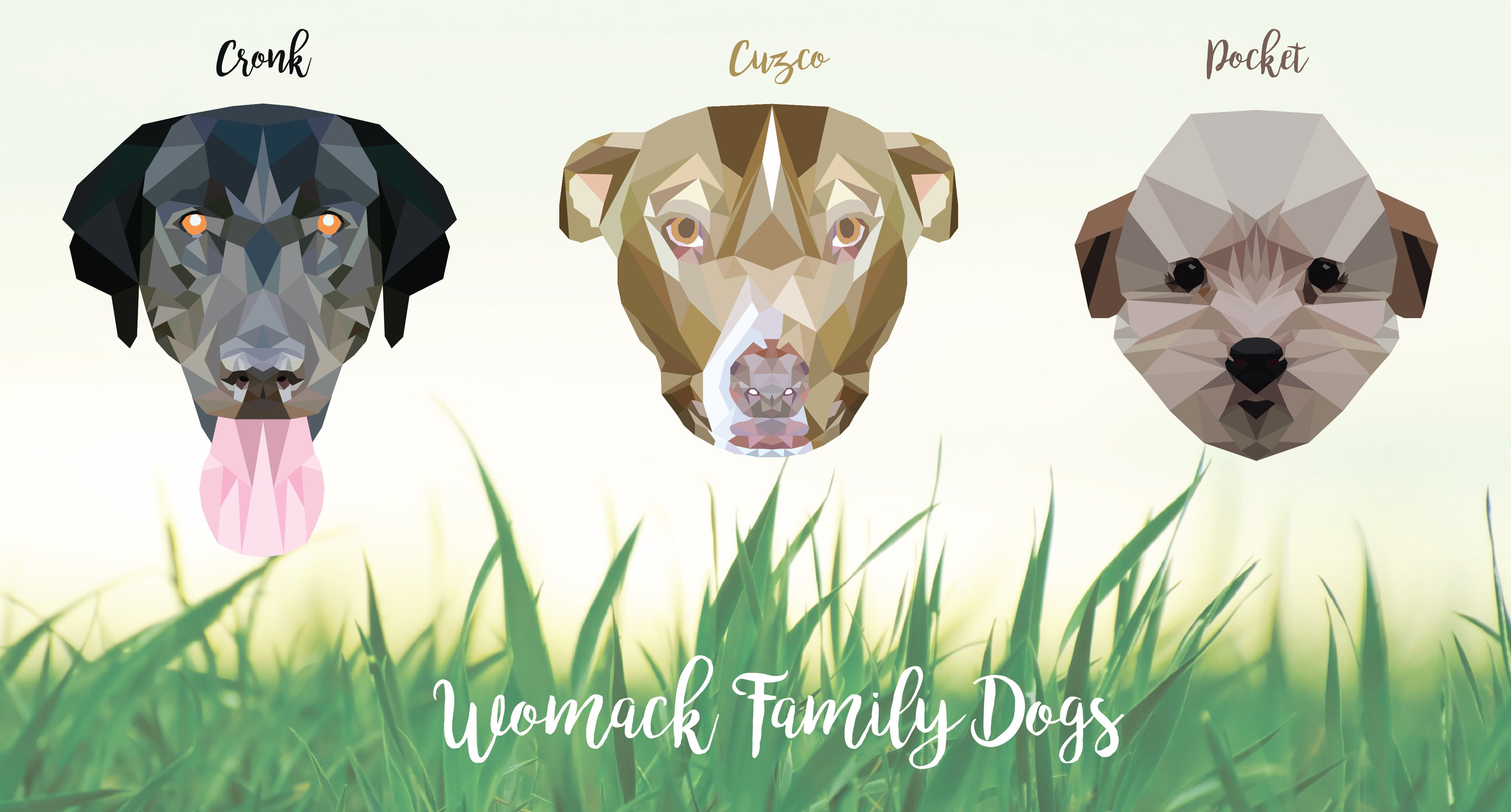
I wanted to make a gift for my parents to thank them for all the help and support they gave me at my recent wedding. So I decided to make a family portrait of our dogs in a style that I’ve been dying to learn – geometric! I watched some tutorials and got designing in Adobe Illustrator.
Here’s some screenshots of my progress (they progress from right to left):


Here’s how all the dogs turned out:
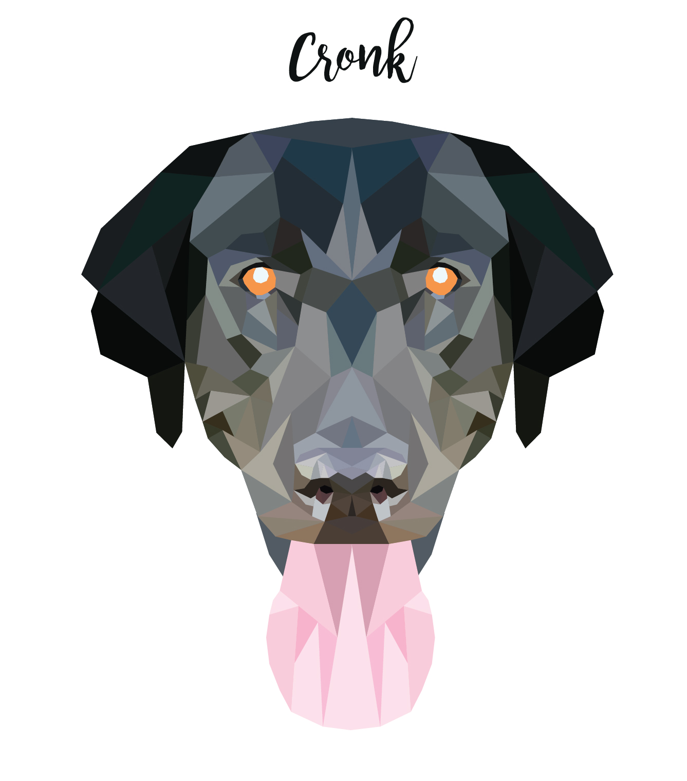
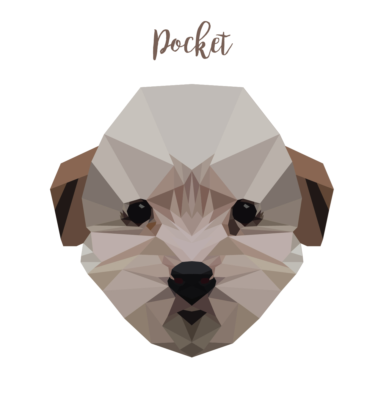
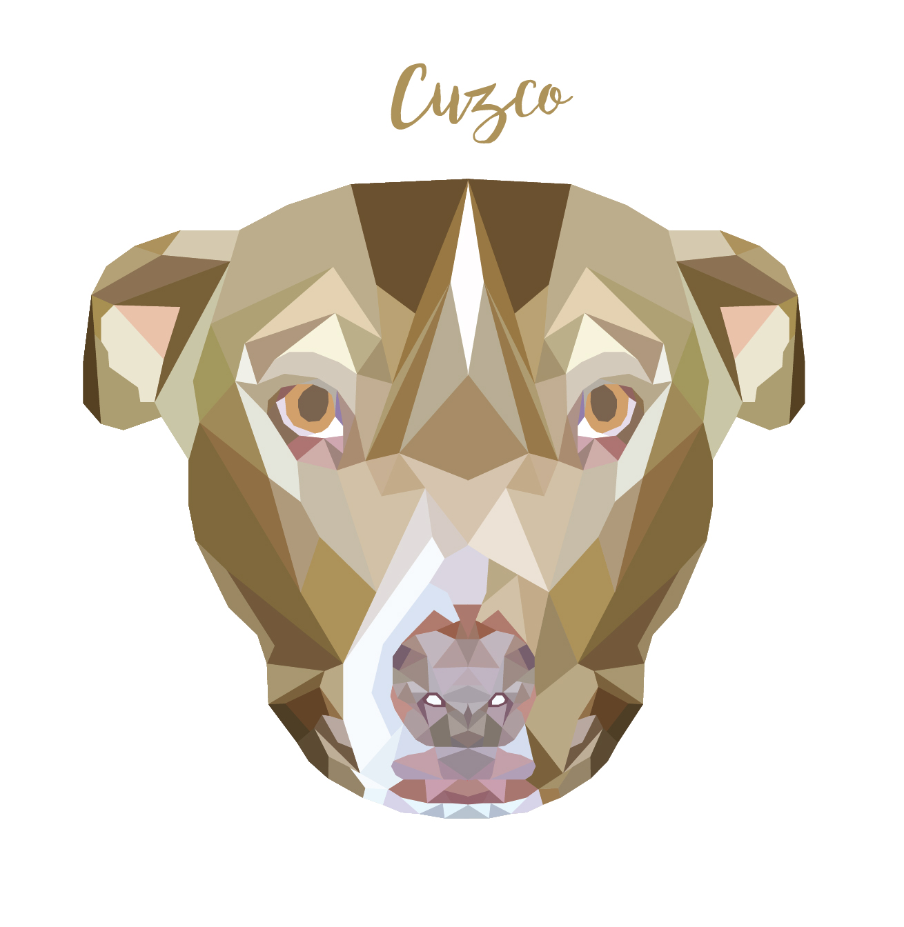
And finally here’s all of them together as part of one happy family 🙂 It was so much fun learning this technique and will definitively be returning to it in the future.
Sound Will Heal – Website Revamp
Sound Will Heal is a holistic healing company that offers clients a service called “sound healing” it’s a guide meditation using unique sounds. I had the opportunity to revamp their website. The bulk of the work I did was on the events tab because it was very disorganized. I was able to organize the photos, add an event calendar, insert a YouTube video into the main home page, make customizations and tidy up the overall appearance of the website.
Check out the whole website here http://soundwillheal.com/
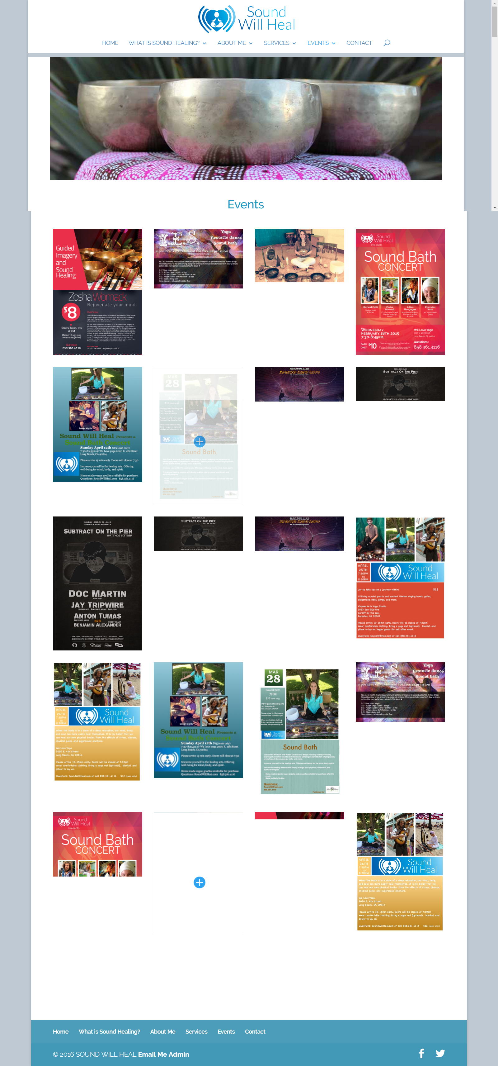
Before
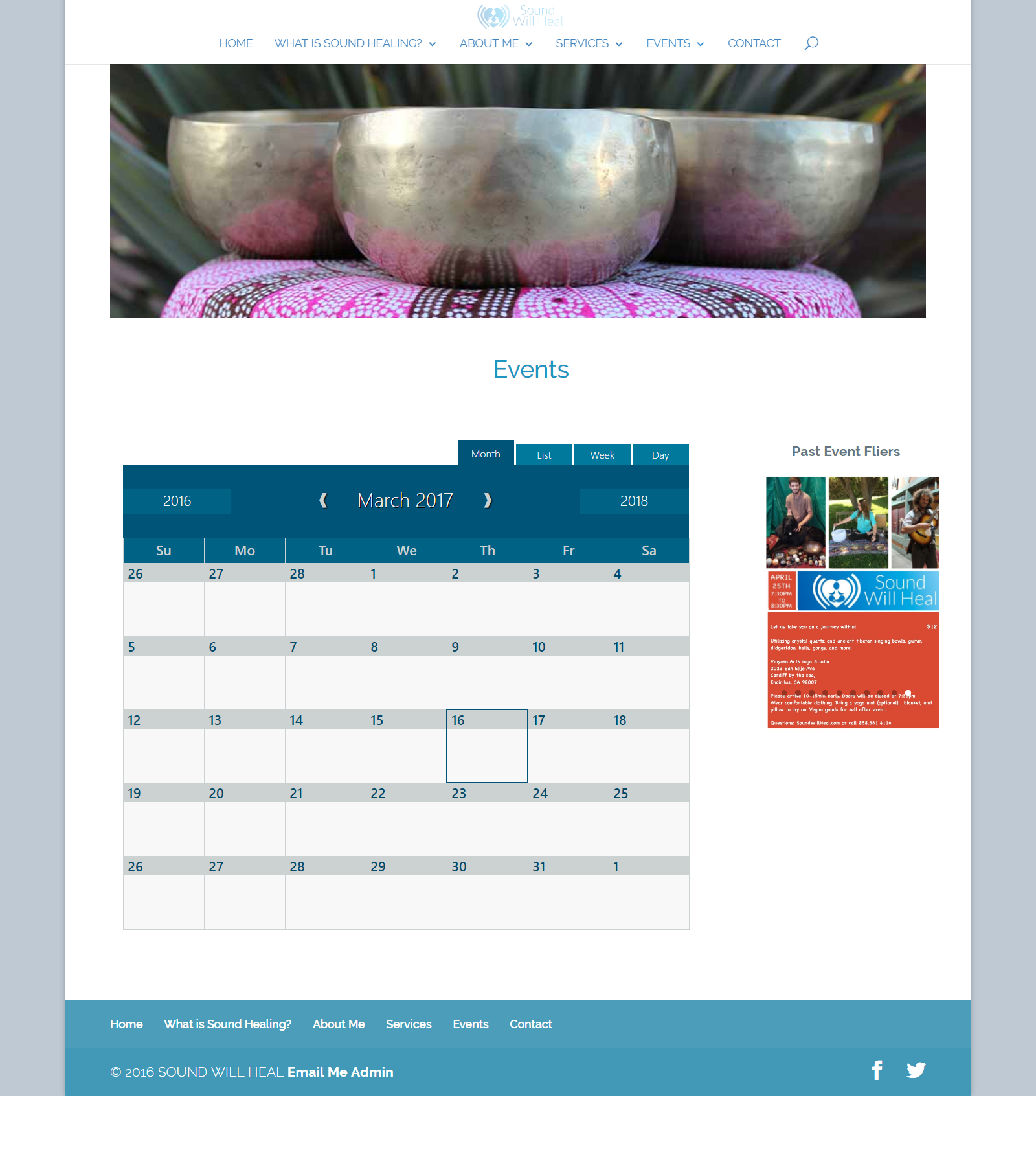
After
Creative Edits
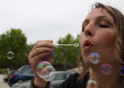
Macro: Close Up & Personal
Life in Motion
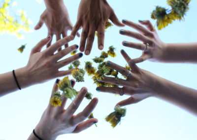
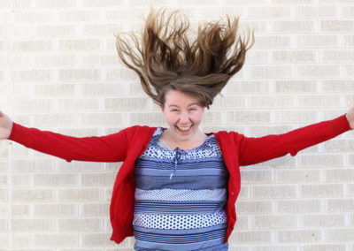
The first picture with that hands and the falling dandelions was an evolution of ideas. I originally had my friend throwing the dandelions but they clumped together and I had two other friends try to throw them up as well but they always clumped. So we came up with the idea of just slightly tossing them and letting them fall, which gave a really natural and cool effect. The aperture and shutter speed are tricky and getting them just right can be tough, but when one does it right you can get some amazing pictures!
Christina & Jared
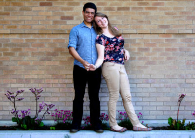
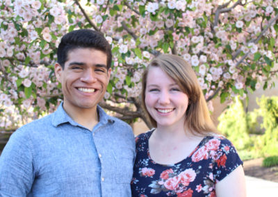
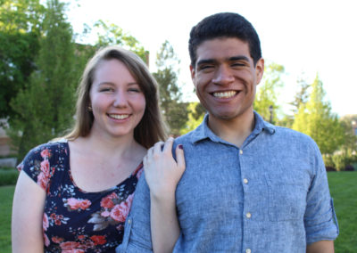
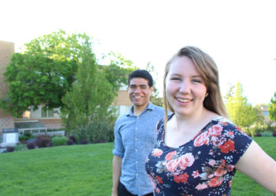
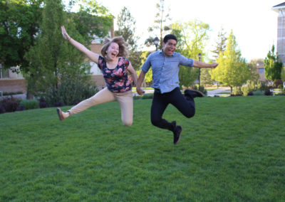
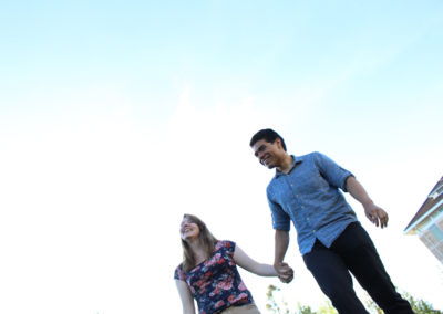
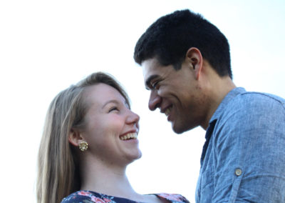
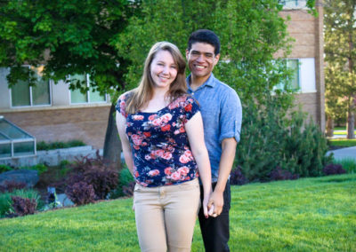
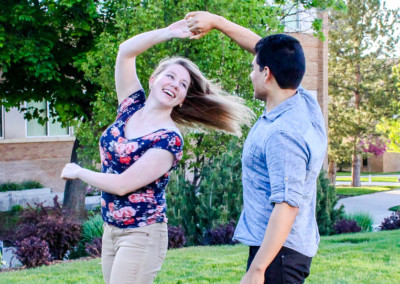
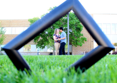
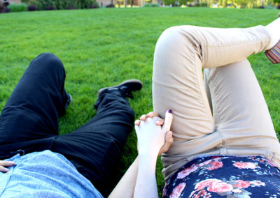
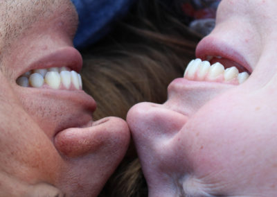
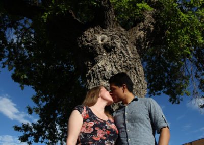
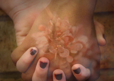
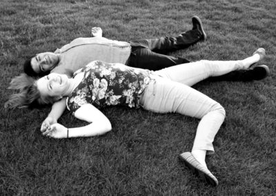
My cute couple for this shoot were my lovely roommate at the time Christina and her soon to be fiance Jared. We had some good laughs as I awkwardly posed them and got up close and personal with my camera. I did a variety of close up and far away shots as well as really trying to capture different perspectives.
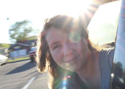
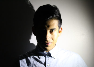
Portraits
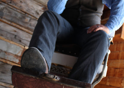
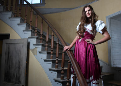
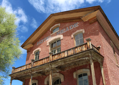
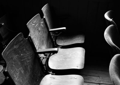
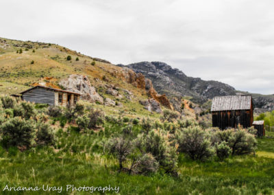
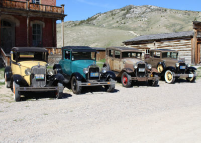
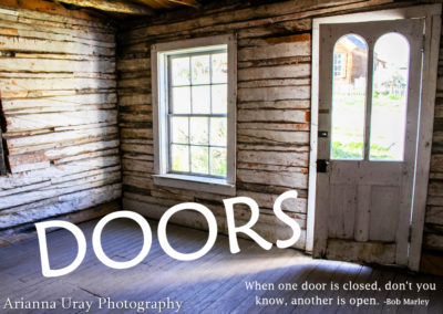
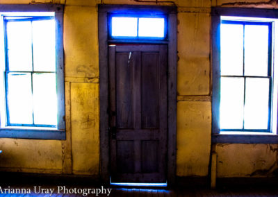
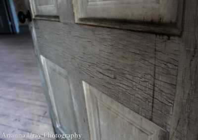
Bannack, Montana – Fine Art
Tasteful Typography
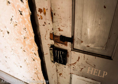
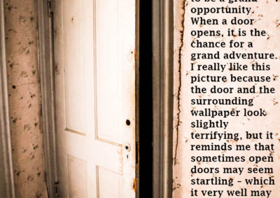
I wanted to go for a creepy vibe and originally had some scary quotes picked out like “no one can hear you scream from inside” along with a few others, but I decided that I didn’t want to go that route. Instead I picked a gentler concept and selected fonts that would match the vibe I was going for. Although I did have a little fun with the “help” one… haha.
Title: Maiandra GD Regular, Sans-serif/decorative
Body Copy: Lucida Fax Regular, serif
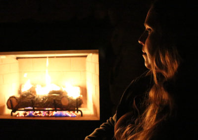
The Night Scene
Product Redesign: Baby Pickles
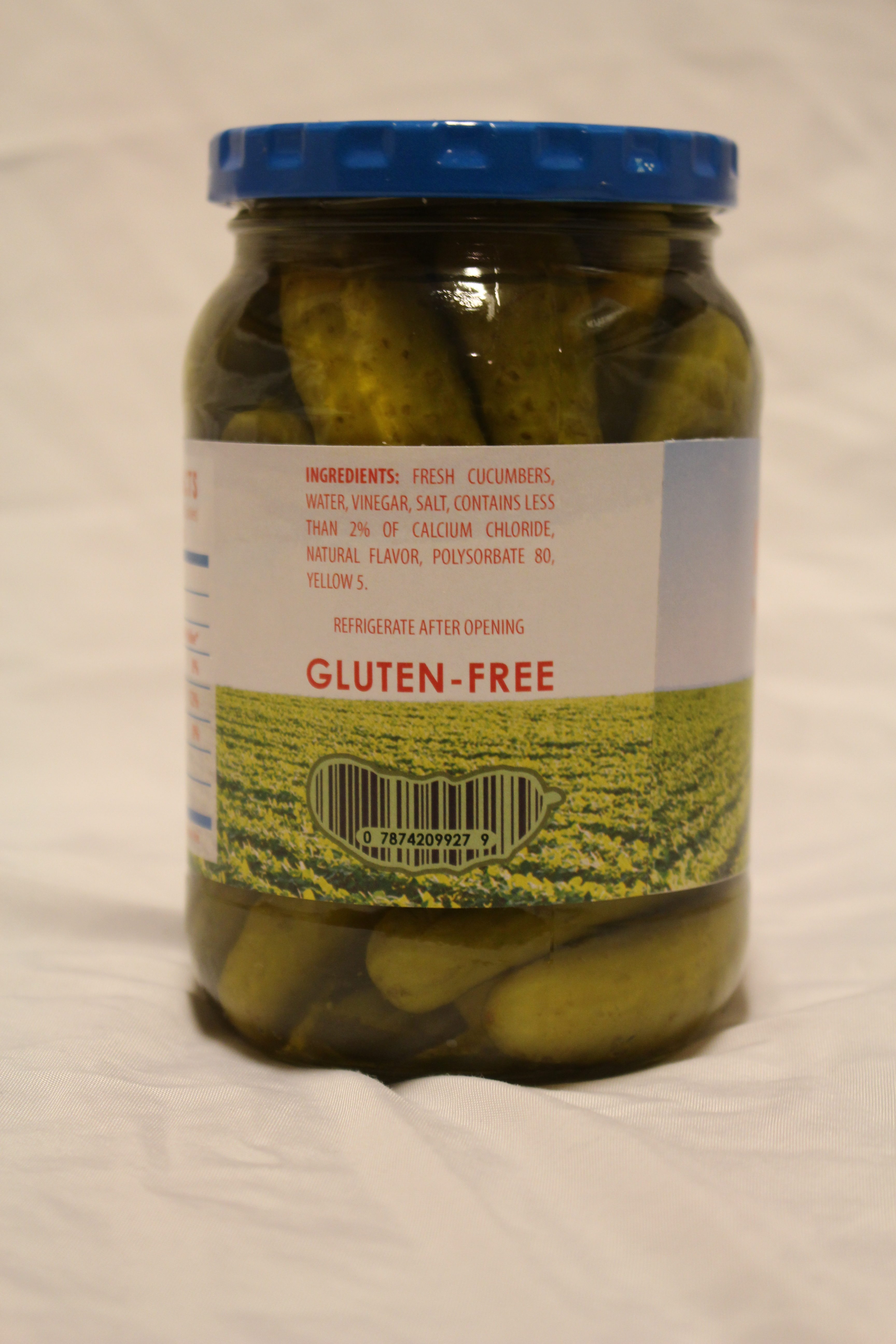
For this project I was to find a product that had an uninteresting product label and redesign it to appeal more to a target audience and thus promote more sales. I chose to redesign the label for Great Value baby pickles. I chose this product because I love pickles and because the design could definitely use a major face-lift.
TARGET AUDIENCE
My target audience are trendy millennials who are health conscious and into organic, kosher items. I wanted my design to be bright, sleek, simple, and trendy.
I have chosen this target audience because it is completely different than who current pickle jars are targeting. Take a look at what the shelf of pickles looks like at Walmart:
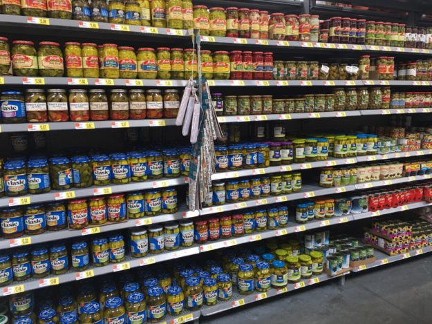
All of them have vector graphics and use blue, green, purple, and yellow. Which is what inspired how I made my design because I want my design to stand out and look completely different than what’s currently being done.
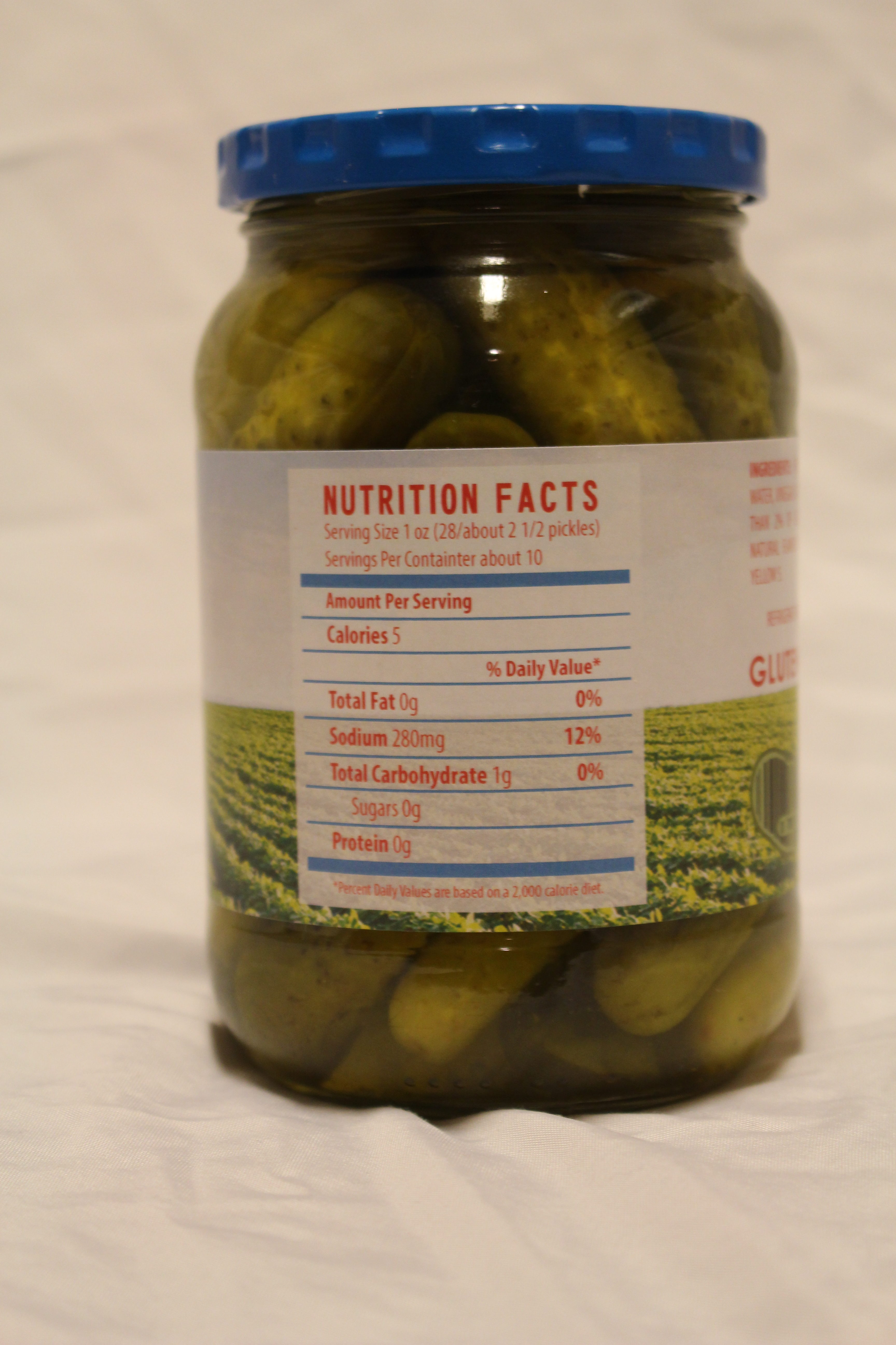
 This is the specific pickle jar I decided to redesign because it seems to lack interest and excitement. It looks like everything else on the shelf.
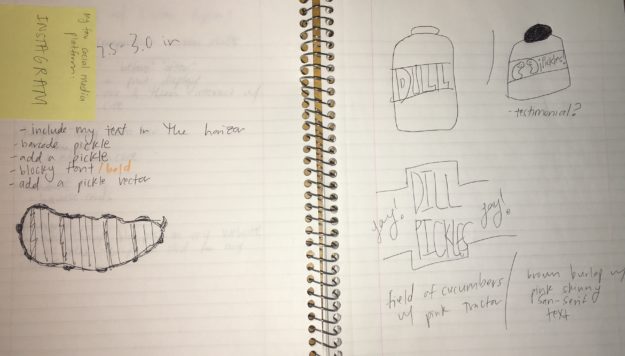
SKETCHES
COLOR SCHEME
I wanted pink to be the primary color because it’s so different than what’s on the shelf and also because it is a trendy, bright color. The other colors complement my main color.

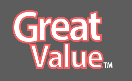
MODIFIED LOGO

Original Logo
Redesigned Logo
I decided to keep the same logo but I wanted to incorporate my color scheme into the logo so I recreated it so that I could use my pink color and remain consistent throughout my design.
DRAFTS
These take you on a journey through the progression of my design:

This was the original image I used however it wasn’t high enough resolution to continue using so I found the image used in my designs below and contacted the owners of the image and they gave me permission to use it!

I really liked the design of this one however when printed out the brown was way too dark and wasn’t quite the feel that I was going for. I loved the light pink text however I had to give that up in order to make my design look overall more appealing.

I made this one with the idea of having the leading lines of the crops lead you right to the word “pickles” however I discovered that it was distracting having the text touch the skyline. It looked much cleaner to have the text in the sky rather than touching the skyline.

I wanted to take a simpler approach and see how that felt, I liked this design but I felt it was underdeveloped and a little too simple. So I decided to stick with having an image in the background.
DETAILS
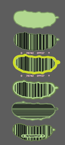
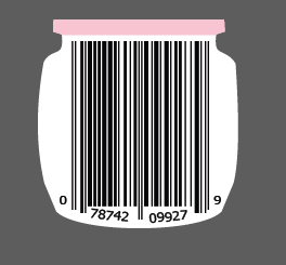
I played around a lot with my different font choices and trying to make a creative bar code, below pictures my journey.
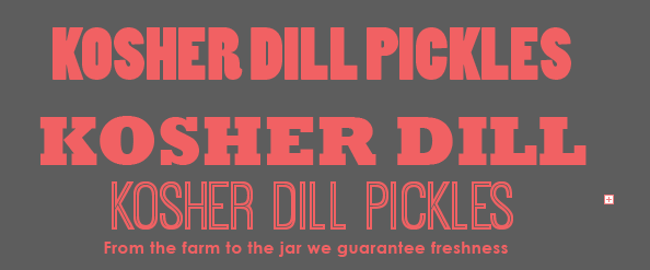
FINAL DESIGN


CONSTRUCTION PROCESS
The construction required a lot of patience and diligence. I printed my design on sticker paper and in order to get it on the jar just right I had to apply the sticker a few times to the jar.
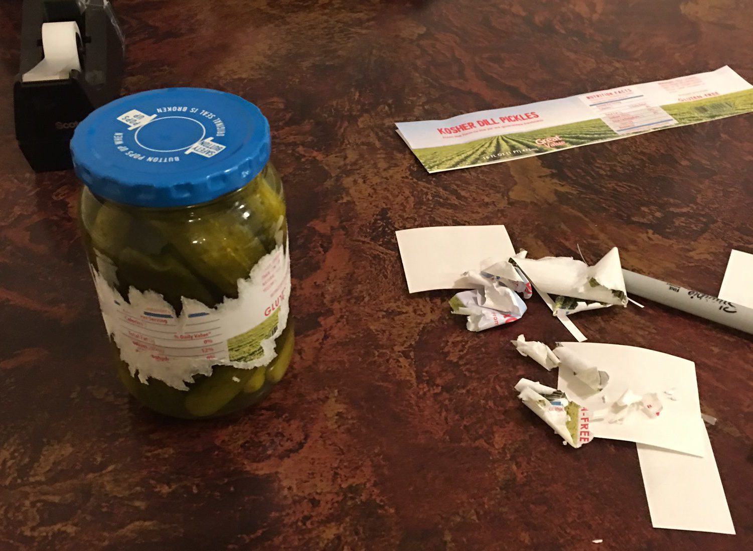
FINAL PRODUCED NEW DESIGN
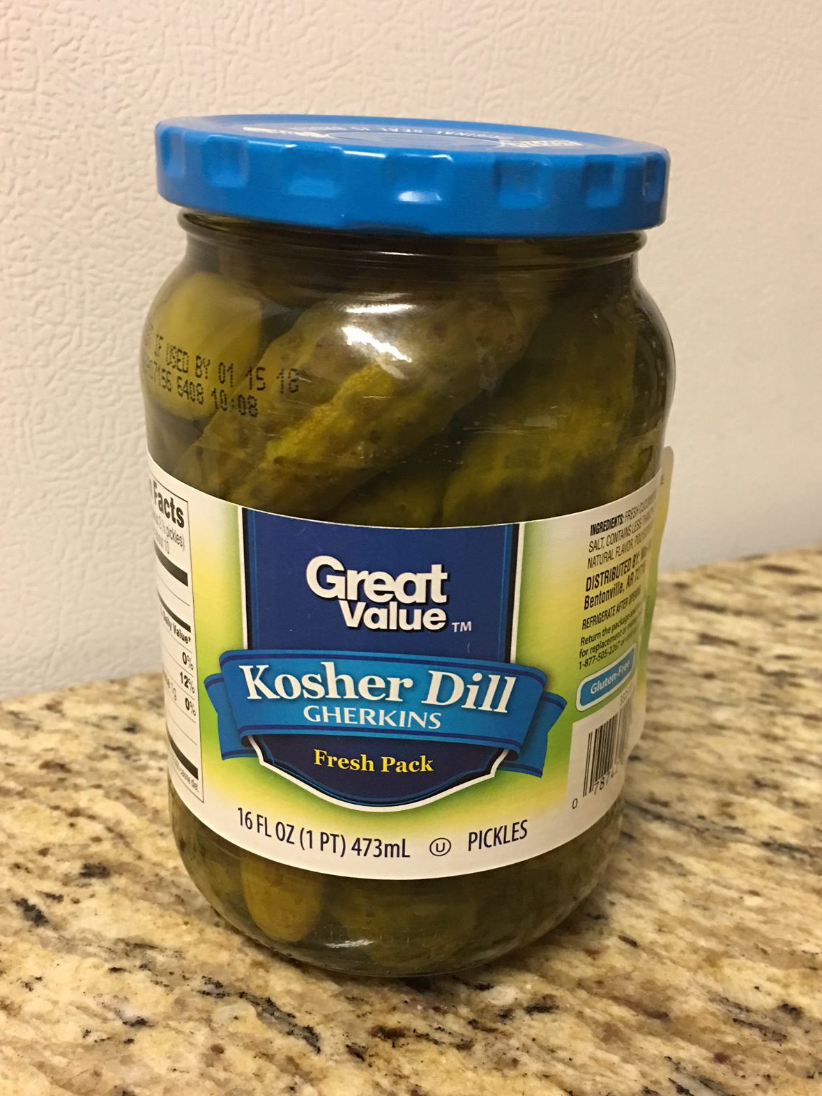
Before
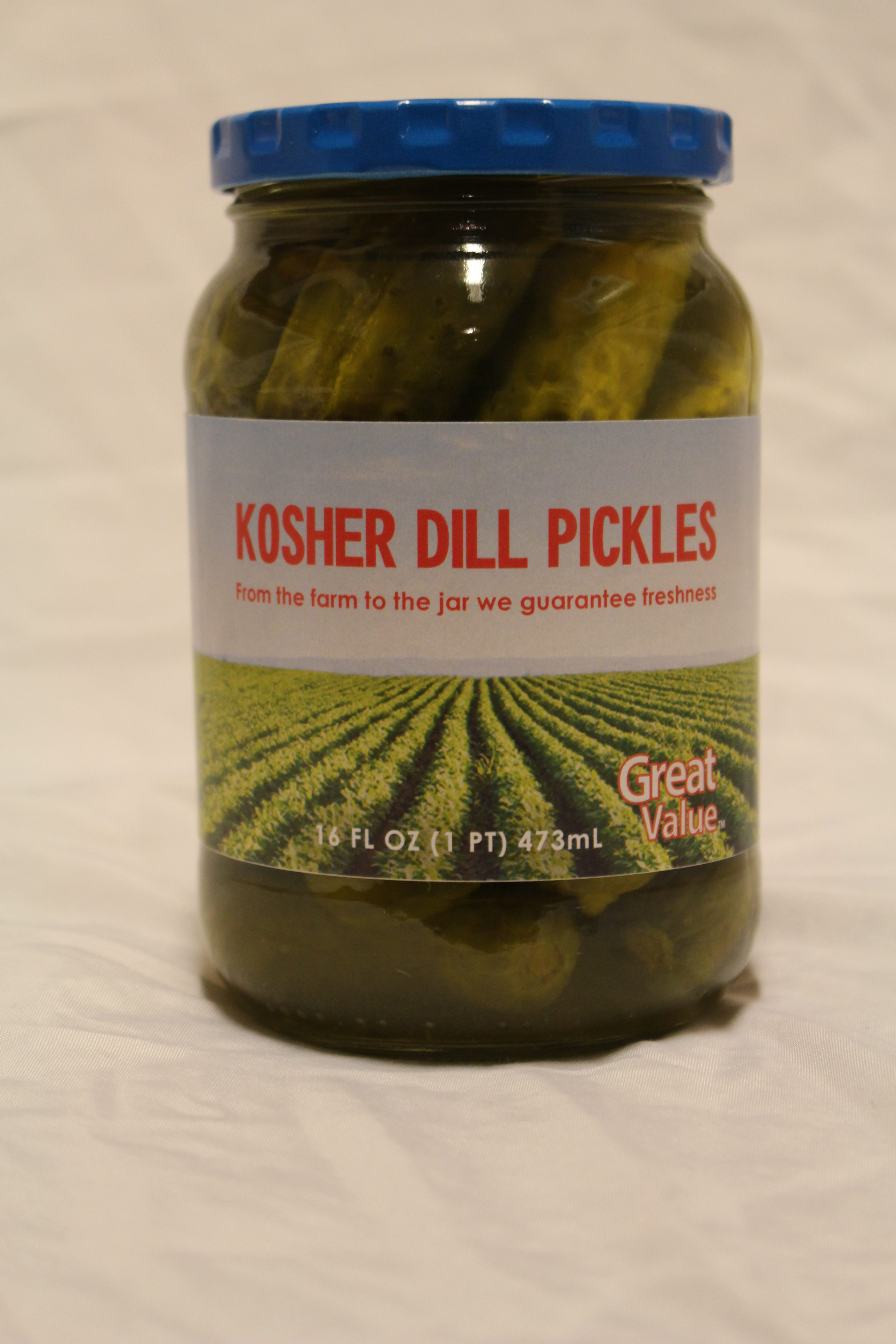
After
REDESIGN JUSTIFICATION & PROJECTED INCREASE IN SALES
My new design improves the design because it uses new and more exciting colors. It also uses an real life image which as I had mentioned before all of the other designs are only vector graphics. The use of a photograph is new and trendy, especially since my target audience is millennials. Millennials love social media site like Instagram because they use photos, so this will be something that catches their attention, along with the vibrant pink and blue. These new design elements will differentiate these pickles and promote more sales.
Band Poster
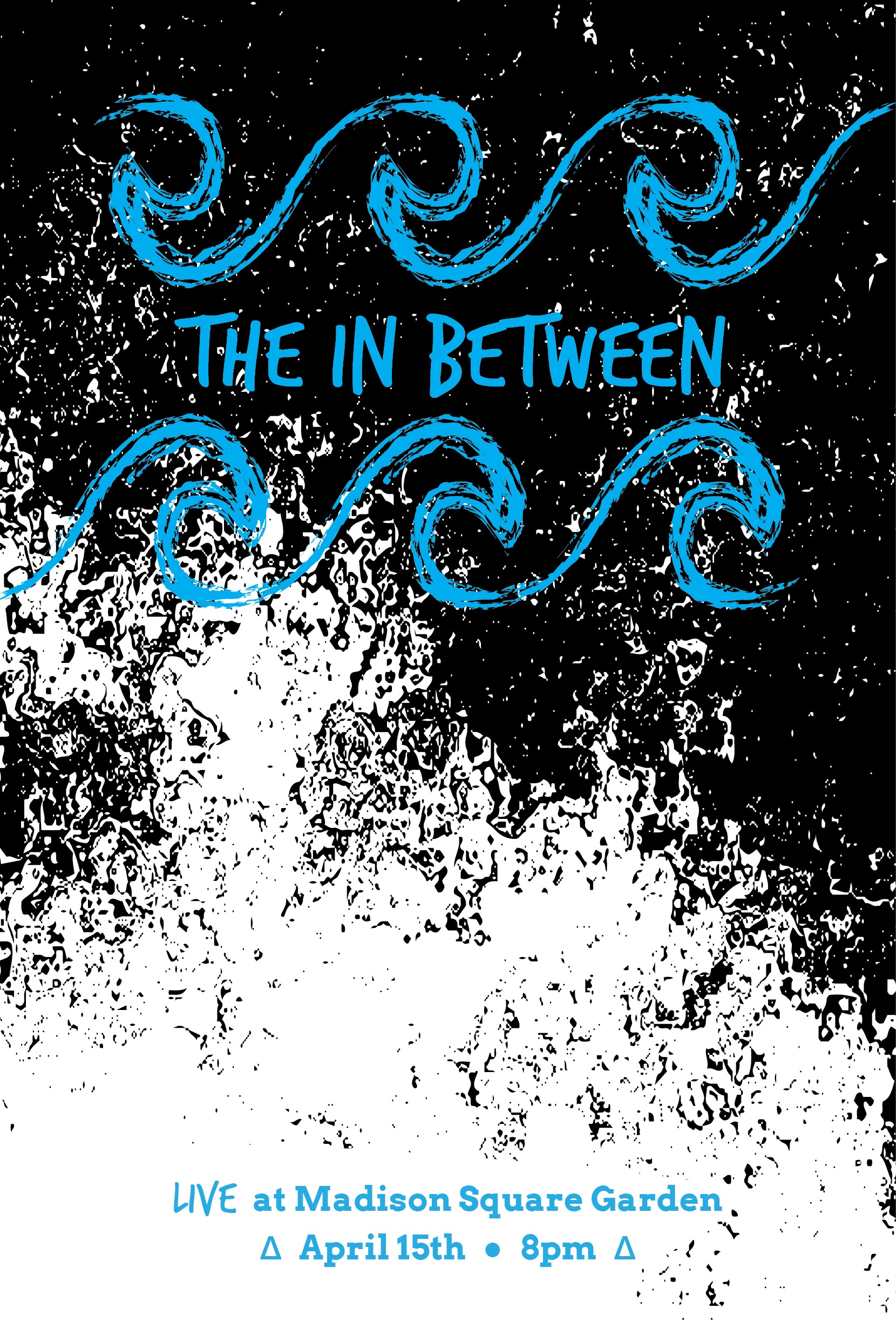
I made a band poster! The band is made up by me but I wanted to convey the feeling of a edgy, hipster, indie band!
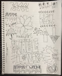
SKETCHES
DRAFTS
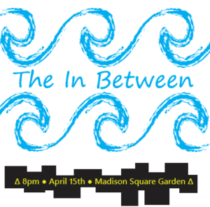
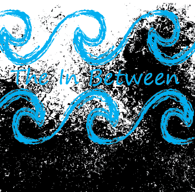 These were my first few drafts as I started designing in Adobe Illustrator. I liked the idea of waves when the idea came to add a cool textured background. I actually vectorized a textured image that I found off the internet.
This is the image that I vectored:
FINAL
This is my final! Enjoy!
Stickers: Fiesta a la Mexicana!!
I decided to make Mexican themed stickers because stickers are all about showcases a piece of your personality and because I lived in Mexico for a year and a half (and because I’m marrying a Mexican 🙂 ) I feel like I connect to the culture and feel a special bond.
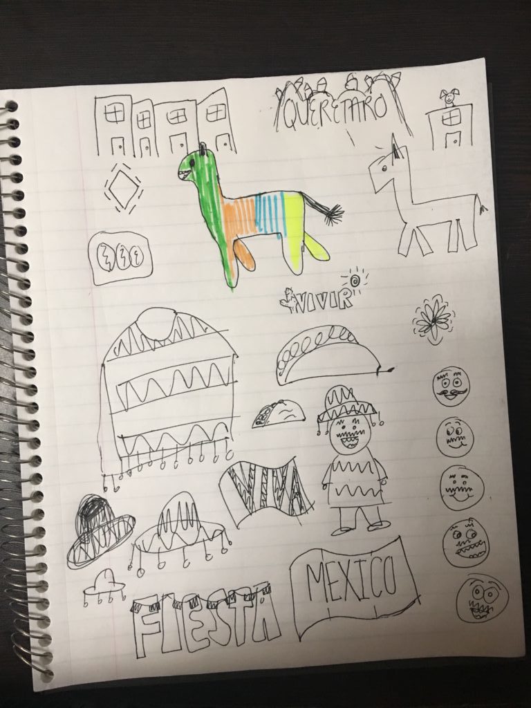
SKETCHES
I really liked the Mexican man in the poncho, the taco, and the word “fiesta” so I decided to focus my efforts on those three designs.
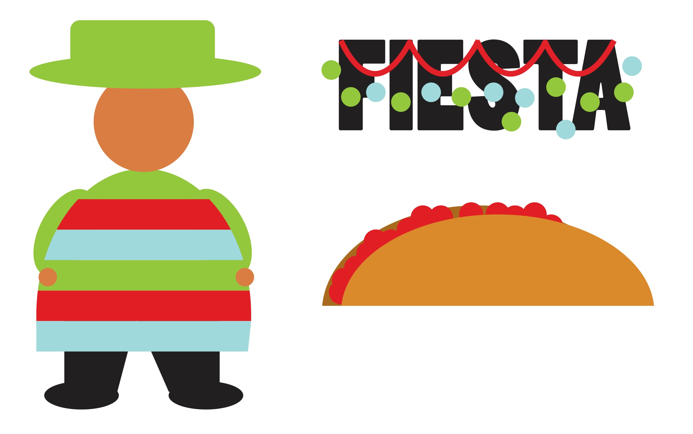
DRAFT PHASE
These were my first two drafts however as you can see they lacked life and interest. They definitely still needed a face-lift.
These were the photos I used as references as I started to refine my designs:
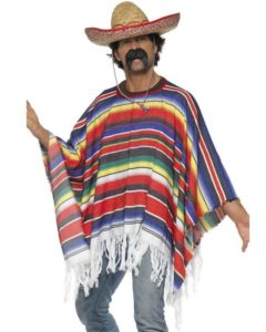
This one to understand how the lines in the poncho design are affected as they fall over the shoulders of the person wearing it.

This one to understand the shape of a “typical” Mexican mustache.

This one to understand the shape of a sombrero.
FINAL
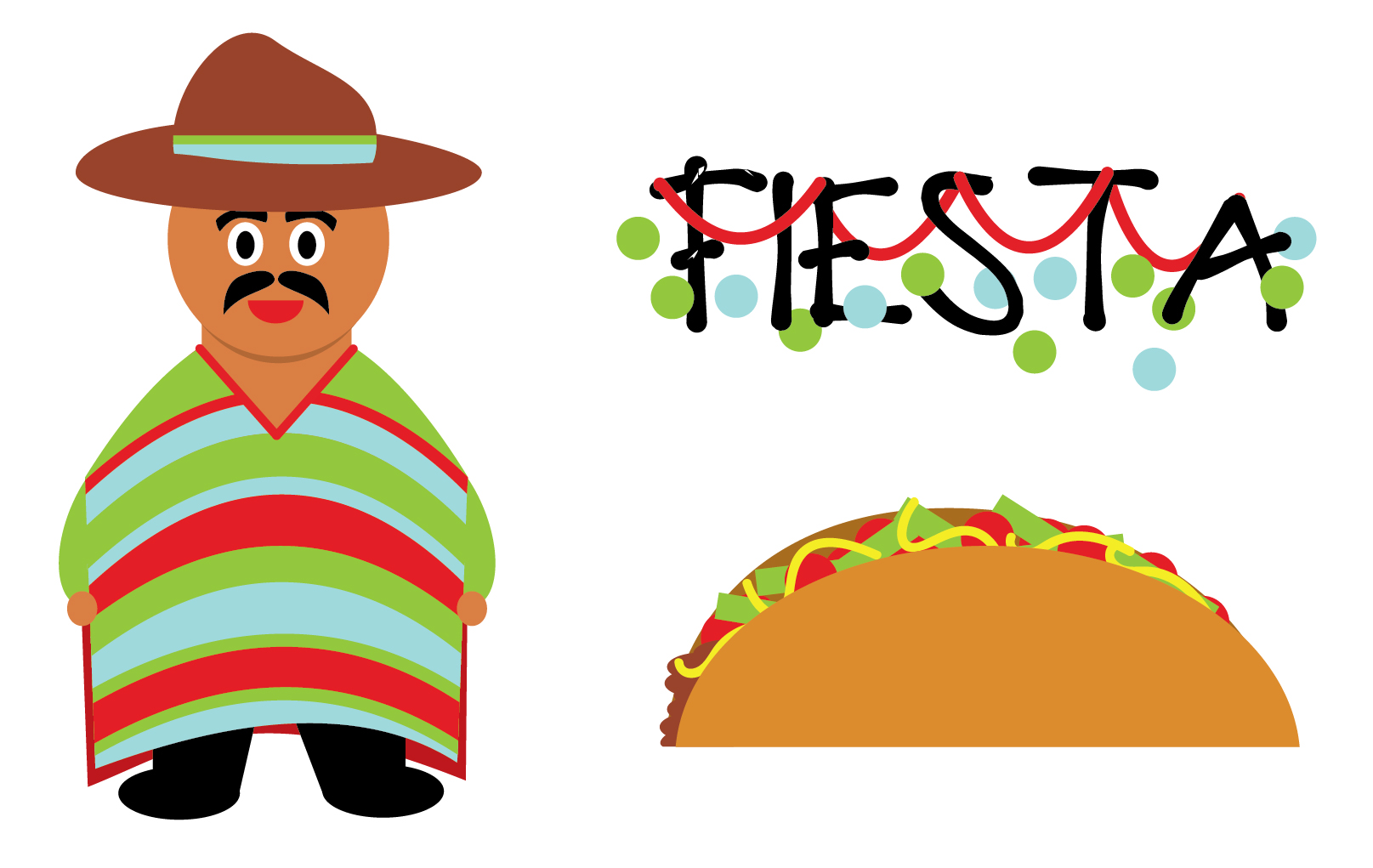
This is my final design and I’m proud to mention that after my class had a huge sticker swap I have seen classmates with my stickers on the back of their phones and laptops 🙂 I think they’re very fun and show personality!
Wedding Facts Infographic
For this project I was asked to make an infographic using at least three of my original vector designs. I chose to do my infographic about wedding facts because I will be getting married in less than month and I thought it would be fun to learn some fun facts about weddings.
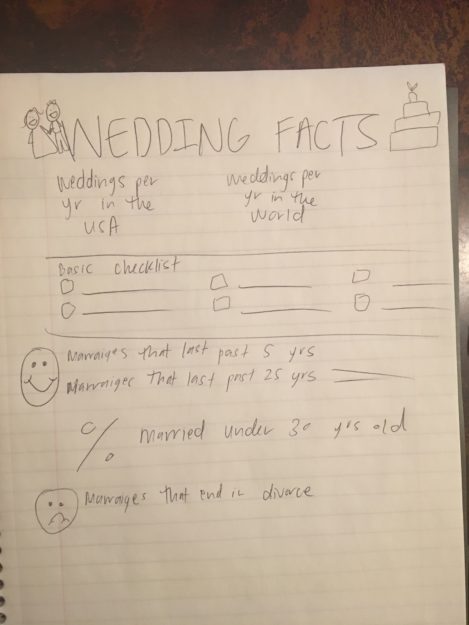
SKETCHING
DRAFTS
I chose to design my whole thing in Adobe Illustrator since I was designing all of my own vector graphics. That way as I chose a size I would be able to resize my designs with no problems. These were my fist drafts after putting it into Adobe Illustrator:
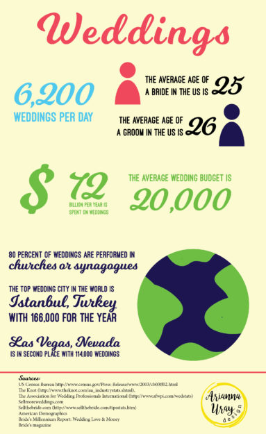
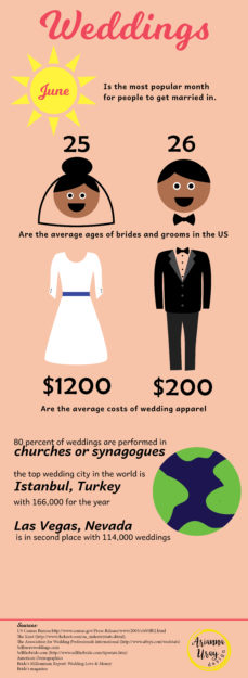
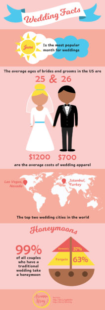
I was told that the script font for the numbers were hard to read and that my first draft had too much text. So I worked on adding more graphics as you can see in my second draft but I was having a really hard time organizing my information in a fluid, readable way. I couldn’t figure out how to de-clutter my sections and that’s when I thought about adding colored squares behind each block of information.
DETAILS
At first I had a ton of colors in mind that I wanted to use, but as I saw my infographic coming along I decided that the following was the most attractive color scheme and did a good job at conveying the feeling of a wedding:

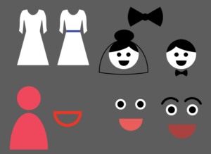
I also had a hard time with making my little bride and groom. I had faces on them at first but after playing around with them for a long time and trying different facial features I determined that giving them no face was the best solution. These were some of the facial features I played around with:
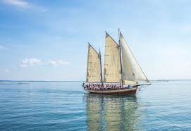
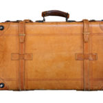
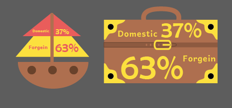 I was also to make a stylized graph and at first I played around with using a boat to convey that 63% of honeymooners travel foreign and 37% travel domestic. However that created confusion that those percentages were conveying how many honeymooners went on cruises, so I decided it would make more sense to use a suitcase to eliminate confusion. This was an early design of my suitcase.

I designed all elements on this page except for the outline of the continents. This was the only thing I borrowed from someone else.
REFERENCE PHOTOS
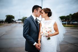
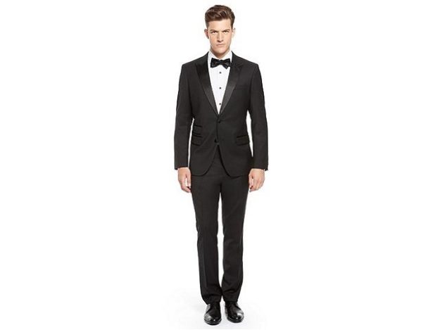
For my other vectors I used these images as references as I designed them:
FINAL
This is my final infographic:
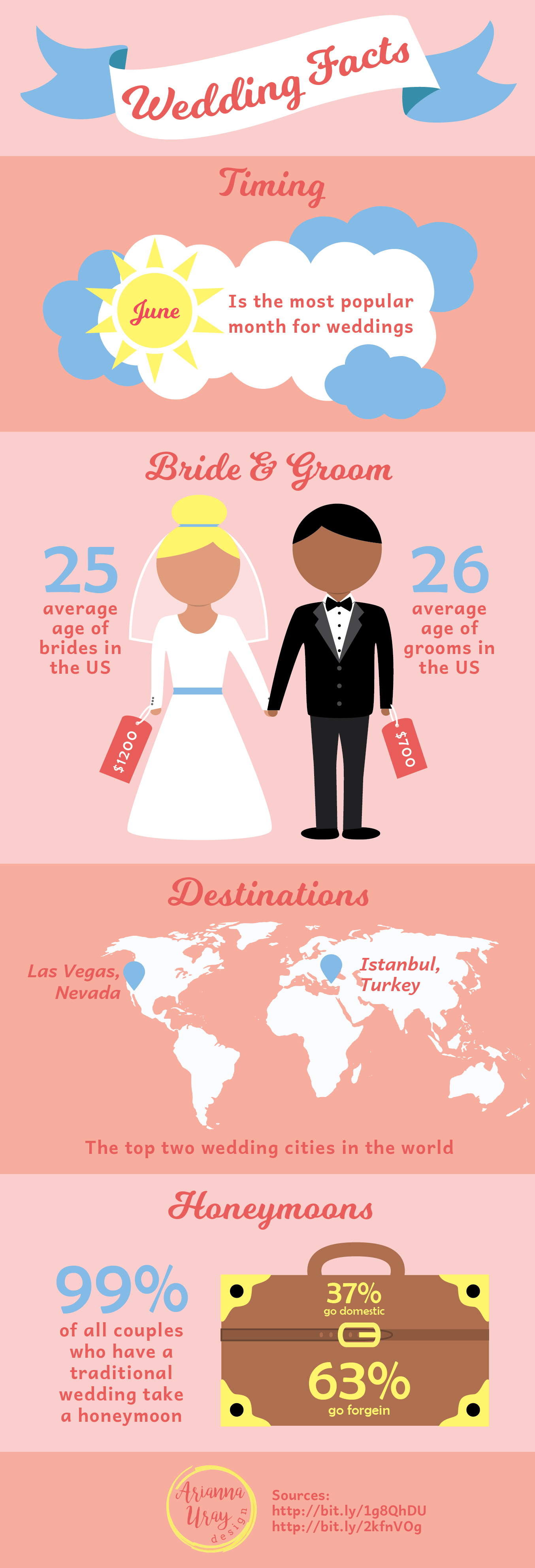
I’m really happy with how it turned out! The fine tuning and extra time really paid off in making this infographic visually appealing and understandable.
I also pinned this on Pinterest and you can check it out on there as well 🙂
https://www.pinterest.com/pin/524036106627176796/
