For this project I was asked to make an infographic using at least three of my original vector designs. I chose to do my infographic about wedding facts because I will be getting married in less than month and I thought it would be fun to learn some fun facts about weddings.
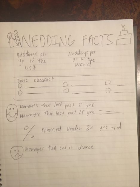
SKETCHING
DRAFTS
I chose to design my whole thing in Adobe Illustrator since I was designing all of my own vector graphics. That way as I chose a size I would be able to resize my designs with no problems. These were my fist drafts after putting it into Adobe Illustrator:
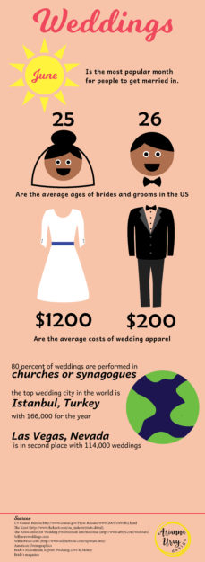
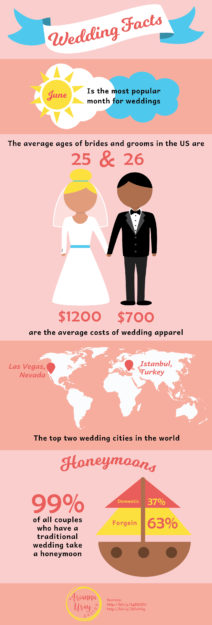
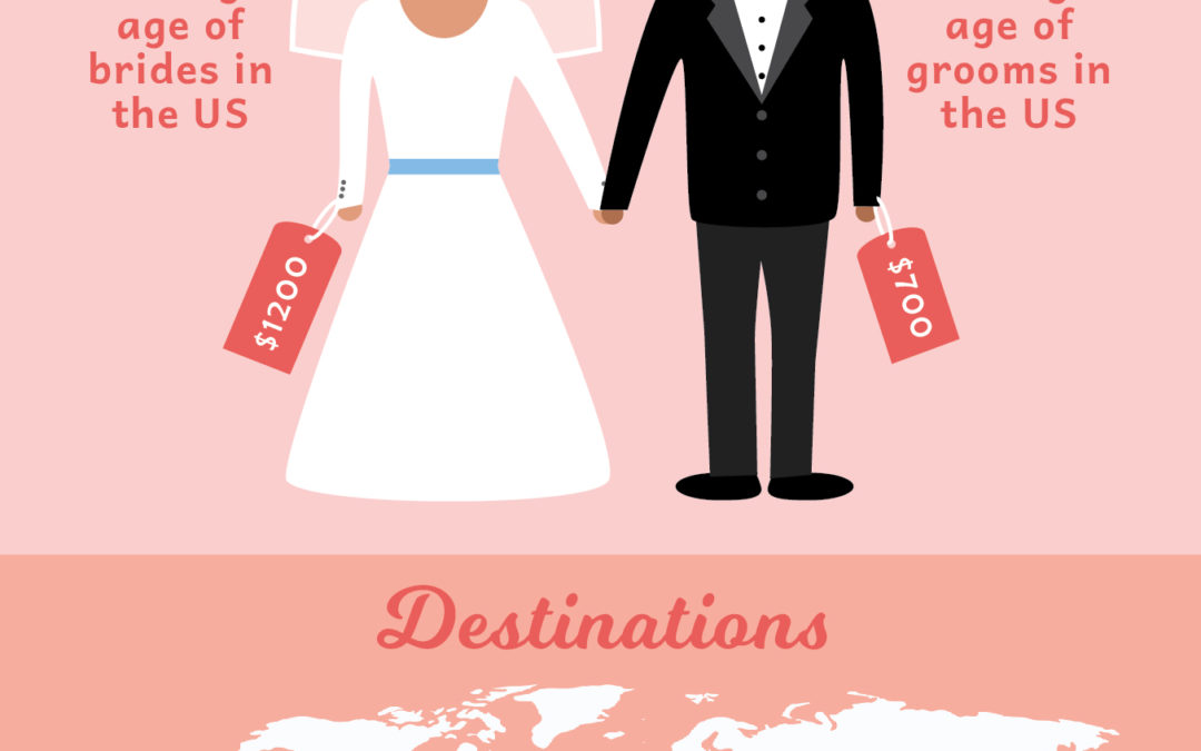
I was told that the script font for the numbers were hard to read and that my first draft had too much text. So I worked on adding more graphics as you can see in my second draft but I was having a really hard time organizing my information in a fluid, readable way. I couldn’t figure out how to de-clutter my sections and that’s when I thought about adding colored squares behind each block of information.
DETAILS
At first I had a ton of colors in mind that I wanted to use, but as I saw my infographic coming along I decided that the following was the most attractive color scheme and did a good job at conveying the feeling of a wedding:

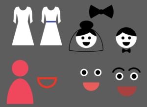
I also had a hard time with making my little bride and groom. I had faces on them at first but after playing around with them for a long time and trying different facial features I determined that giving them no face was the best solution. These were some of the facial features I played around with:
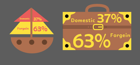 I was also to make a stylized graph and at first I played around with using a boat to convey that 63% of honeymooners travel foreign and 37% travel domestic. However that created confusion that those percentages were conveying how many honeymooners went on cruises, so I decided it would make more sense to use a suitcase to eliminate confusion. This was an early design of my suitcase.

I designed all elements on this page except for the outline of the continents. This was the only thing I borrowed from someone else.
REFERENCE PHOTOS
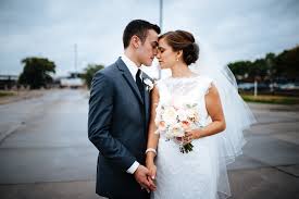
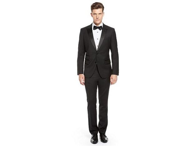
For my other vectors I used these images as references as I designed them:

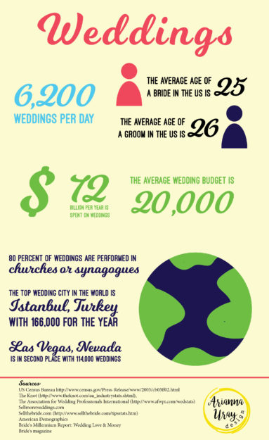
FINAL
This is my final infographic:
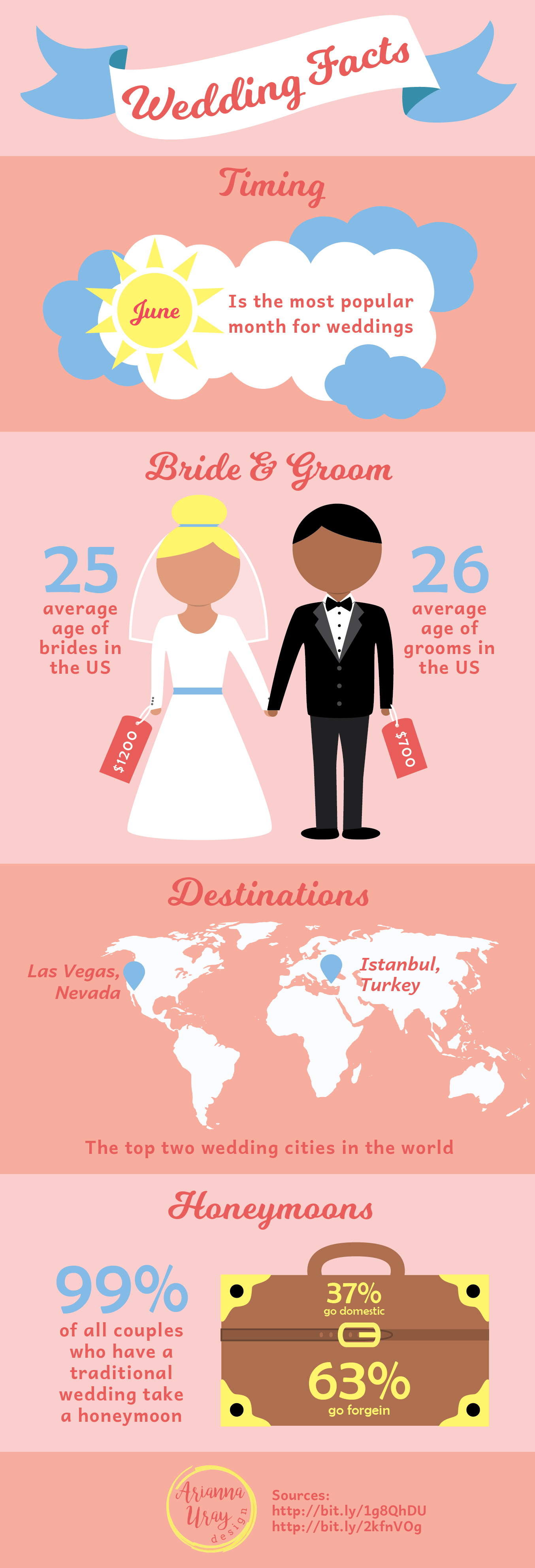
I’m really happy with how it turned out! The fine tuning and extra time really paid off in making this infographic visually appealing and understandable.
I also pinned this on Pinterest and you can check it out on there as well
https://www.pinterest.com/pin/524036106627176796/
