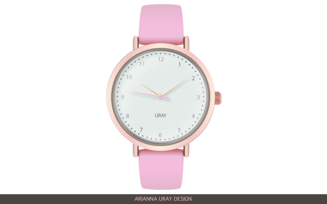
Creating a photo realistic vector graphic was extremely difficult! I was brought on a journey of analyzing what makes things look real verses cartoon-ish for example, the varying light values, colors, circles, shapes and colors of the shadows, etc.
This was the photo of the watch I was basing my vector graphic off of:
SKETCHING
These were my sketches trying to see what makes each shape look like a watch. I focused on the strap, the notches, the shape around the watch, etc. This gave me some direction as I transitioned into my development of the watch in Adobe Illustrator.
DRAFTS
This was my first go around at making a watch in Illustrator… this one was good for laying the foundation of the shapes of things but it lacked completely the lighting and realistic element.
I really had to analyze how the light hit the hands and the face and the outside and inside of the watch. The photo below helped me to see the shadow beneath the hands.
I had a really hard time trying to replicate the diamonds on my reference picture so I decided instead to take the numbers from this watch to simplify the design.
FINAL
I’m really proud with how my final turned out. It’s amazing that you can digitally make things look real. Enjoy!!


