For this project I was to find a product that had an uninteresting product label and redesign it to appeal more to a target audience and thus promote more sales. I chose to redesign the label for Great Value baby pickles. I chose this product because I love pickles and because the design could definitely use a major face-lift.
TARGET AUDIENCE
My target audience are trendy millennials who are health conscious and into organic, kosher items. I wanted my design to be bright, sleek, simple, and trendy.
I have chosen this target audience because it is completely different than who current pickle jars are targeting. Take a look at what the shelf of pickles looks like at Walmart:
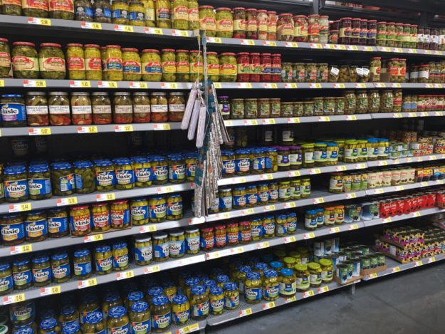
All of them have vector graphics and use blue, green, purple, and yellow. Which is what inspired how I made my design because I want my design to stand out and look completely different than what’s currently being done.
 This is the specific pickle jar I decided to redesign because it seems to lack interest and excitement. It looks like everything else on the shelf.
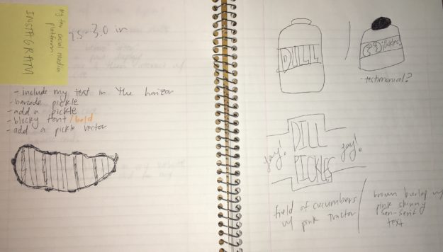
SKETCHES
COLOR SCHEME
I wanted pink to be the primary color because it’s so different than what’s on the shelf and also because it is a trendy, bright color. The other colors complement my main color.

MODIFIED LOGO

Original Logo

Redesigned Logo
I decided to keep the same logo but I wanted to incorporate my color scheme into the logo so I recreated it so that I could use my pink color and remain consistent throughout my design.
DRAFTS
These take you on a journey through the progression of my design:

This was the original image I used however it wasn’t high enough resolution to continue using so I found the image used in my designs below and contacted the owners of the image and they gave me permission to use it!

I really liked the design of this one however when printed out the brown was way too dark and wasn’t quite the feel that I was going for. I loved the light pink text however I had to give that up in order to make my design look overall more appealing.

I made this one with the idea of having the leading lines of the crops lead you right to the word “pickles” however I discovered that it was distracting having the text touch the skyline. It looked much cleaner to have the text in the sky rather than touching the skyline.

I wanted to take a simpler approach and see how that felt, I liked this design but I felt it was underdeveloped and a little too simple. So I decided to stick with having an image in the background.
DETAILS
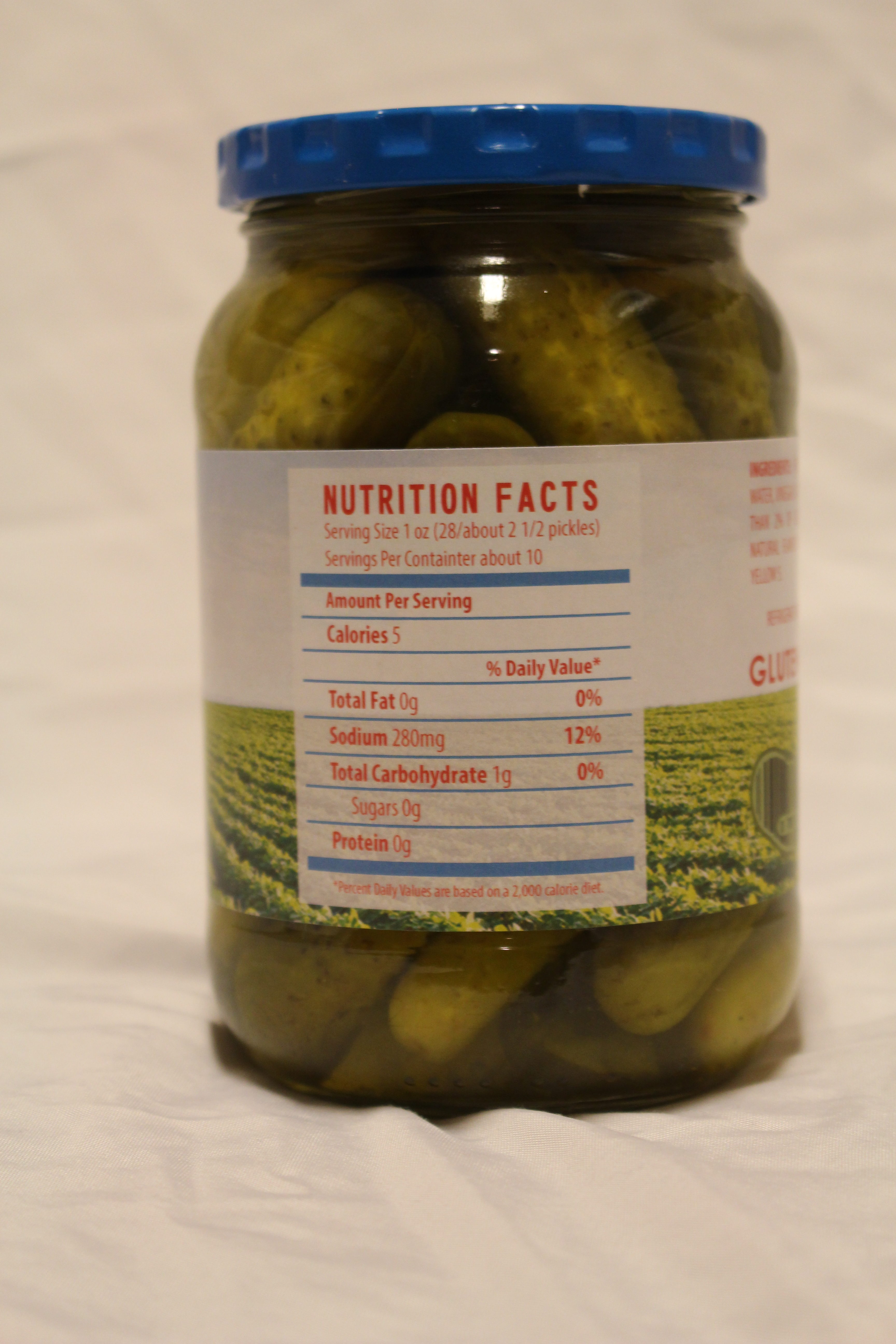
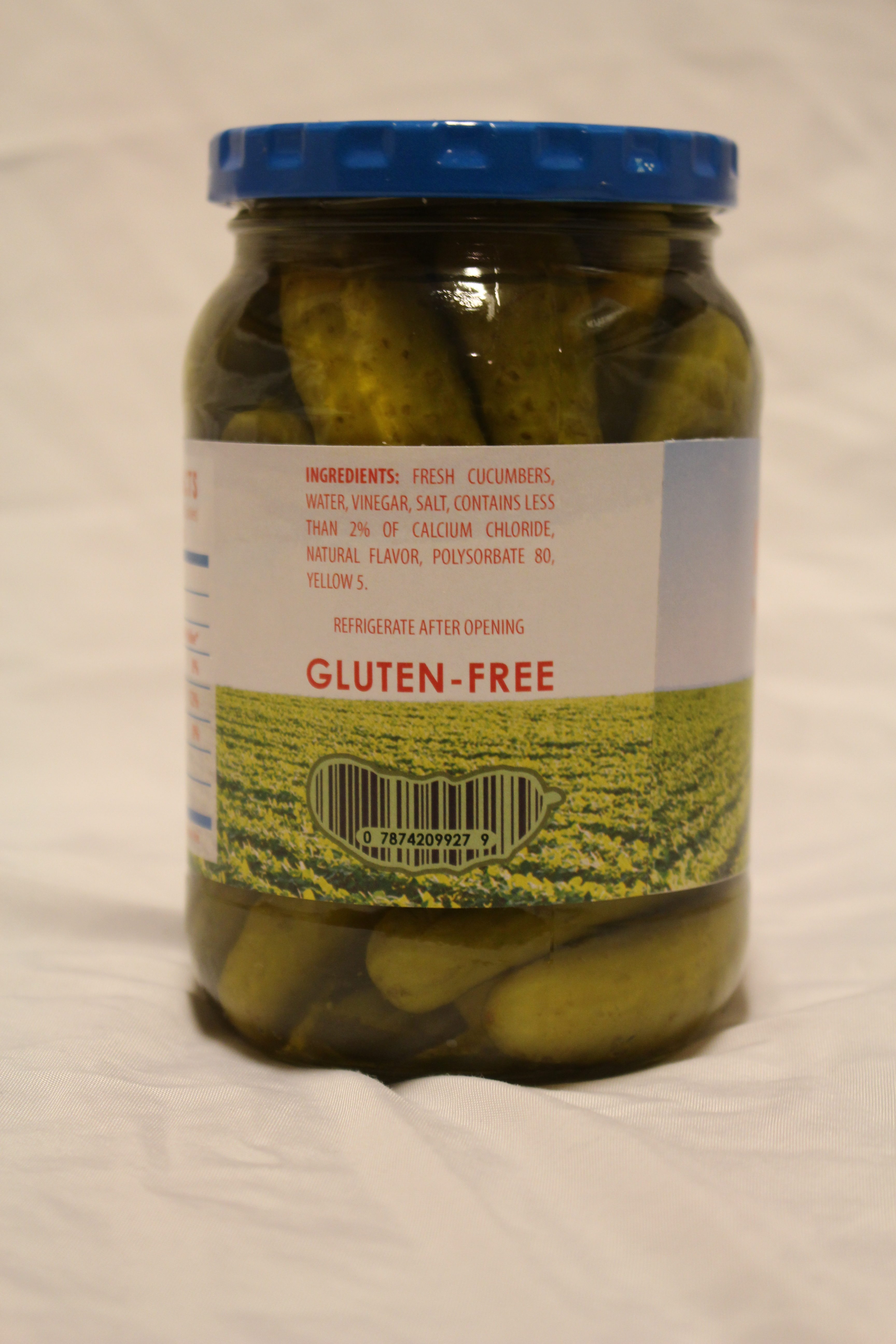
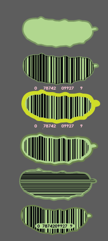
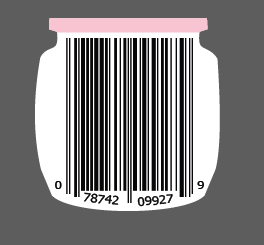
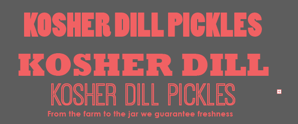
I played around a lot with my different font choices and trying to make a creative bar code, below pictures my journey.
FINAL DESIGN


CONSTRUCTION PROCESS
The construction required a lot of patience and diligence. I printed my design on sticker paper and in order to get it on the jar just right I had to apply the sticker a few times to the jar.
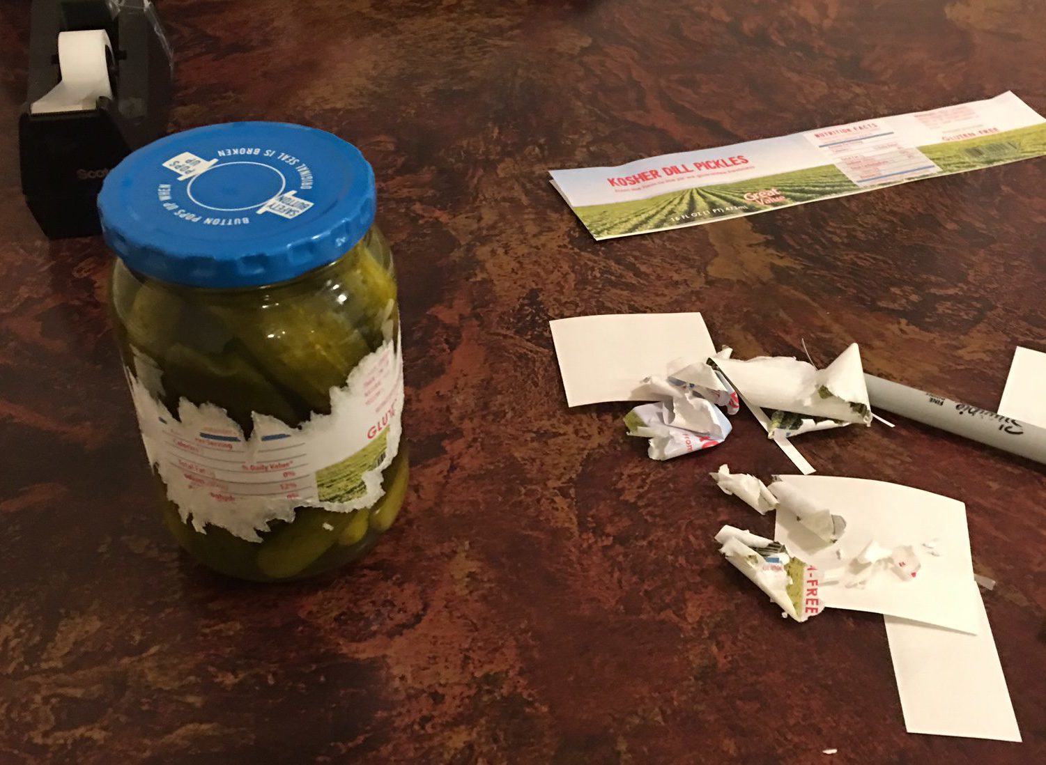
FINAL PRODUCED NEW DESIGN
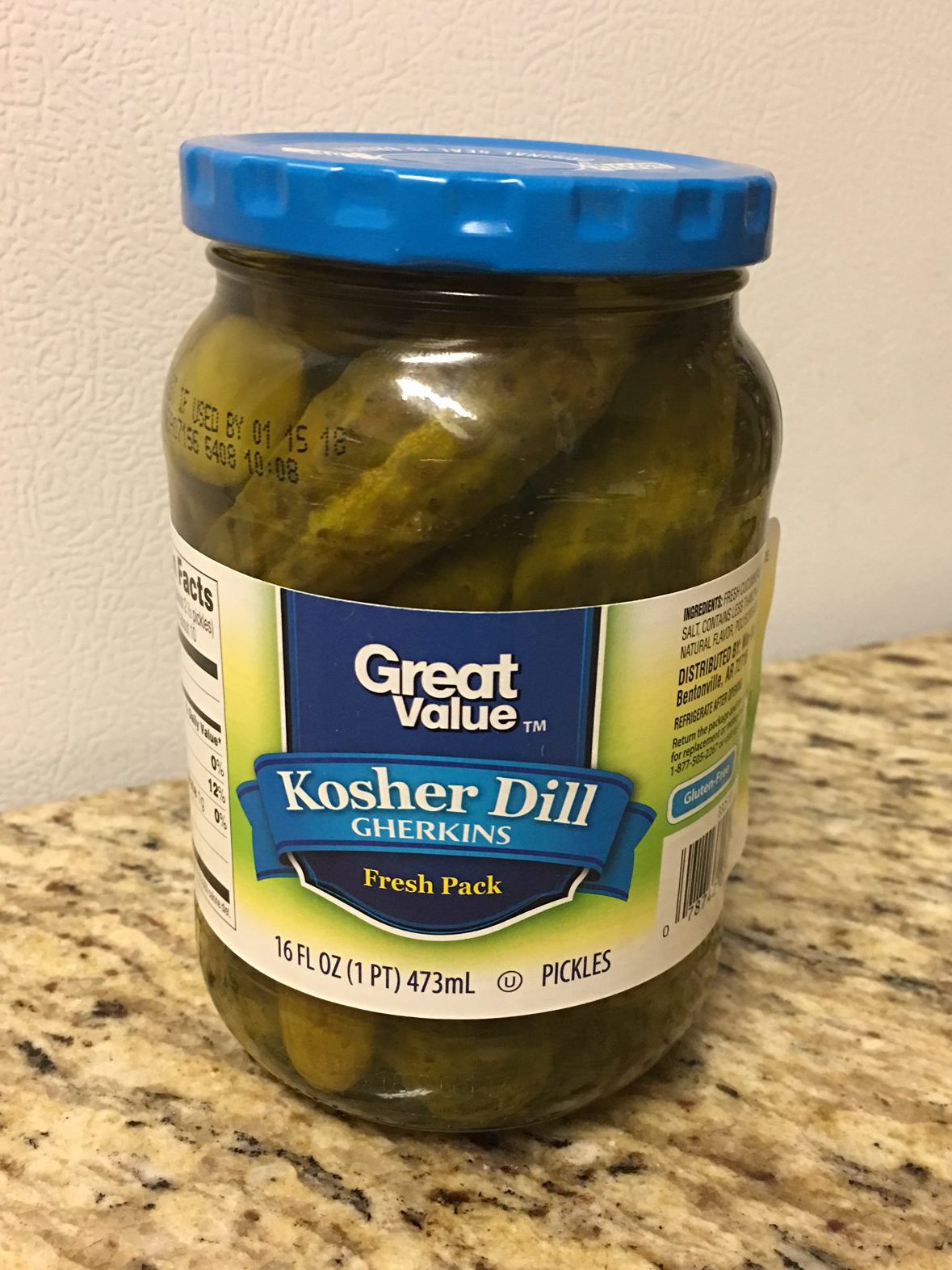
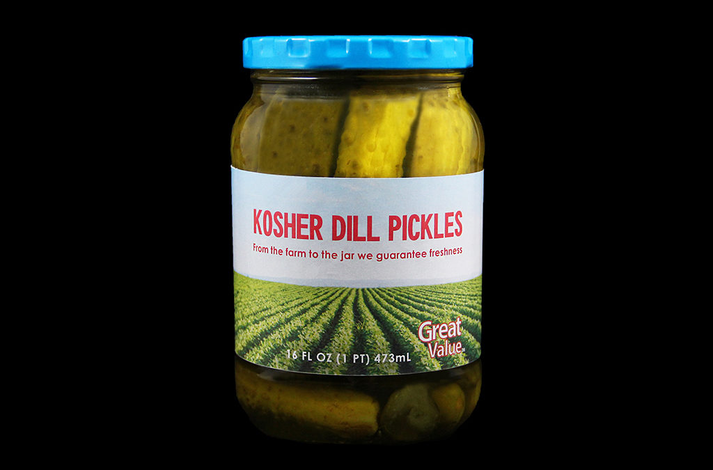
Before
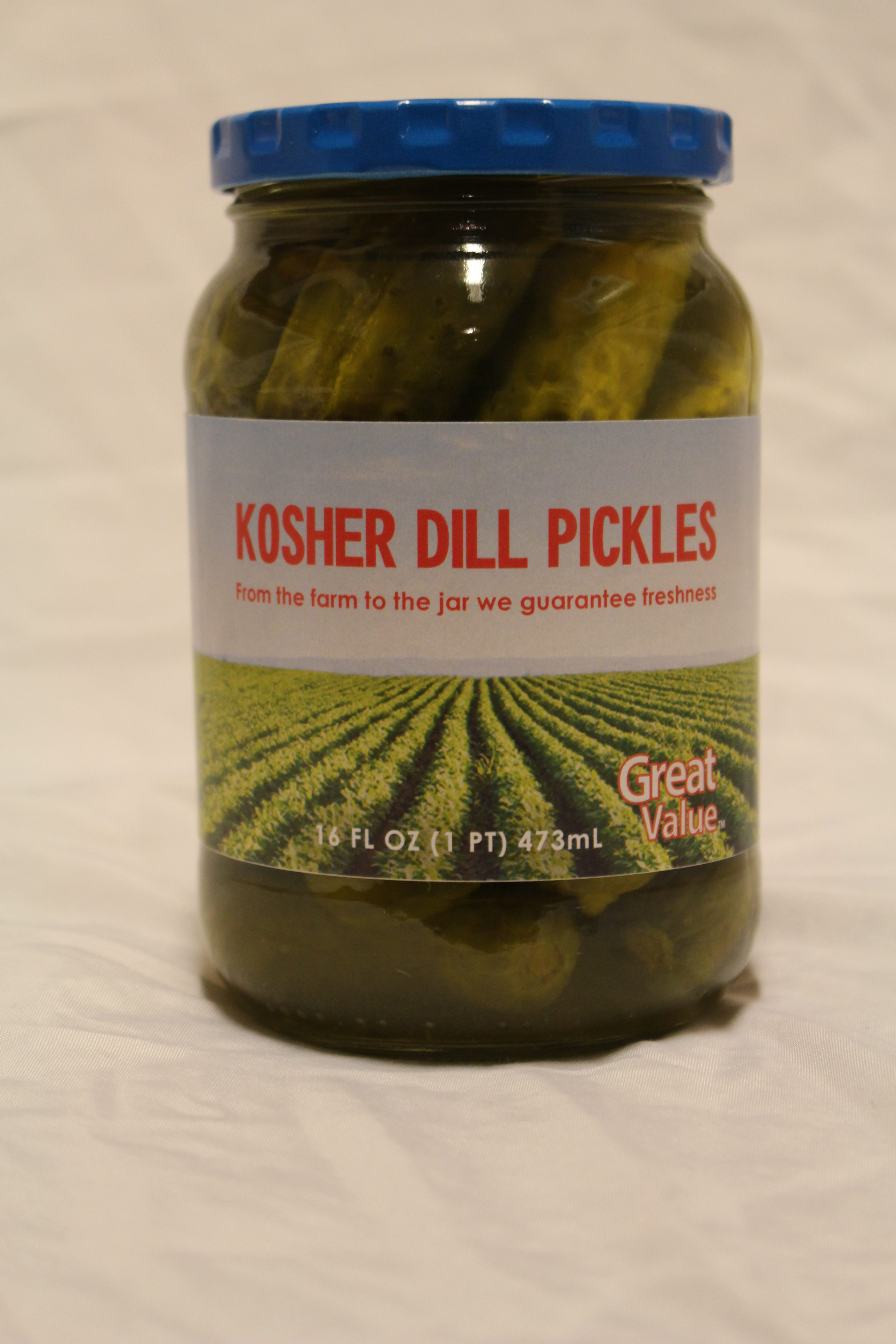
After
REDESIGN JUSTIFICATION & PROJECTED INCREASE IN SALES
My new design improves the design because it uses new and more exciting colors. It also uses an real life image which as I had mentioned before all of the other designs are only vector graphics. The use of a photograph is new and trendy, especially since my target audience is millennials. Millennials love social media site like Instagram because they use photos, so this will be something that catches their attention, along with the vibrant pink and blue. These new design elements will differentiate these pickles and promote more sales.
